
FORME FurnitureConsidered Living
A luxury furniture storefront that brings editorial design and practical shopping together. From colour-specific product galleries to personalised room bundles, every interaction supports a calm, considered buying experience.
Project Perspective
Quiet Luxury Clear Intent
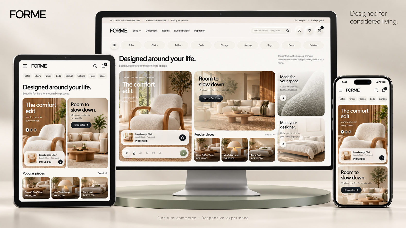
The experience was shaped around how people imagine furniture within their own homes. Generous photography, warm neutral surfaces and restrained visual depth give each piece room to stand out, while clear information and familiar controls keep the shopping journey approachable.
Project Snapshot
Role
Frontend Developer & UI Engineer
Duration
1 Week
Year
2026
Core Stack
Next.js, TypeScript, Tailwind CSS, Redux Toolkit, shadcn/ui, Framer Motion, GSAP, React Icons
Project Overview
FORME is a luxury furniture commerce frontend created for a brand that values thoughtful interiors, material quality and considered presentation. The project translates an approved visual direction into a complete shopping experience, covering the journey from discovering a collection to selecting individual pieces, building a room bundle and managing an order.
The goal was to give the website the character of a designer furniture showroom while keeping everyday shopping tasks straightforward. Customers should be able to appreciate the furniture, understand their options and move through the store with confidence.
Design Direction
The visual language combines warm ivory backgrounds, sage accents, charcoal typography and natural material tones. Generous photography and carefully spaced content establish an editorial rhythm, allowing the furniture to remain the main focus.
Neumorphic buttons, inset form fields, subtle glass surfaces and sculpted badges add tactile depth throughout the interface. These details connect the storefront, authentication pages and customer dashboard through a consistent set of controls. Motion is used selectively for section reveals, navigation transitions and product exploration.
Shopping Experience
The homepage introduces the brand through a photographic hero, category navigation, room collections, product sliders, promotional sections and curated shopping inspiration. Bundle previews, material information, editorial content and supporting FAQs extend the experience beyond a conventional product grid.
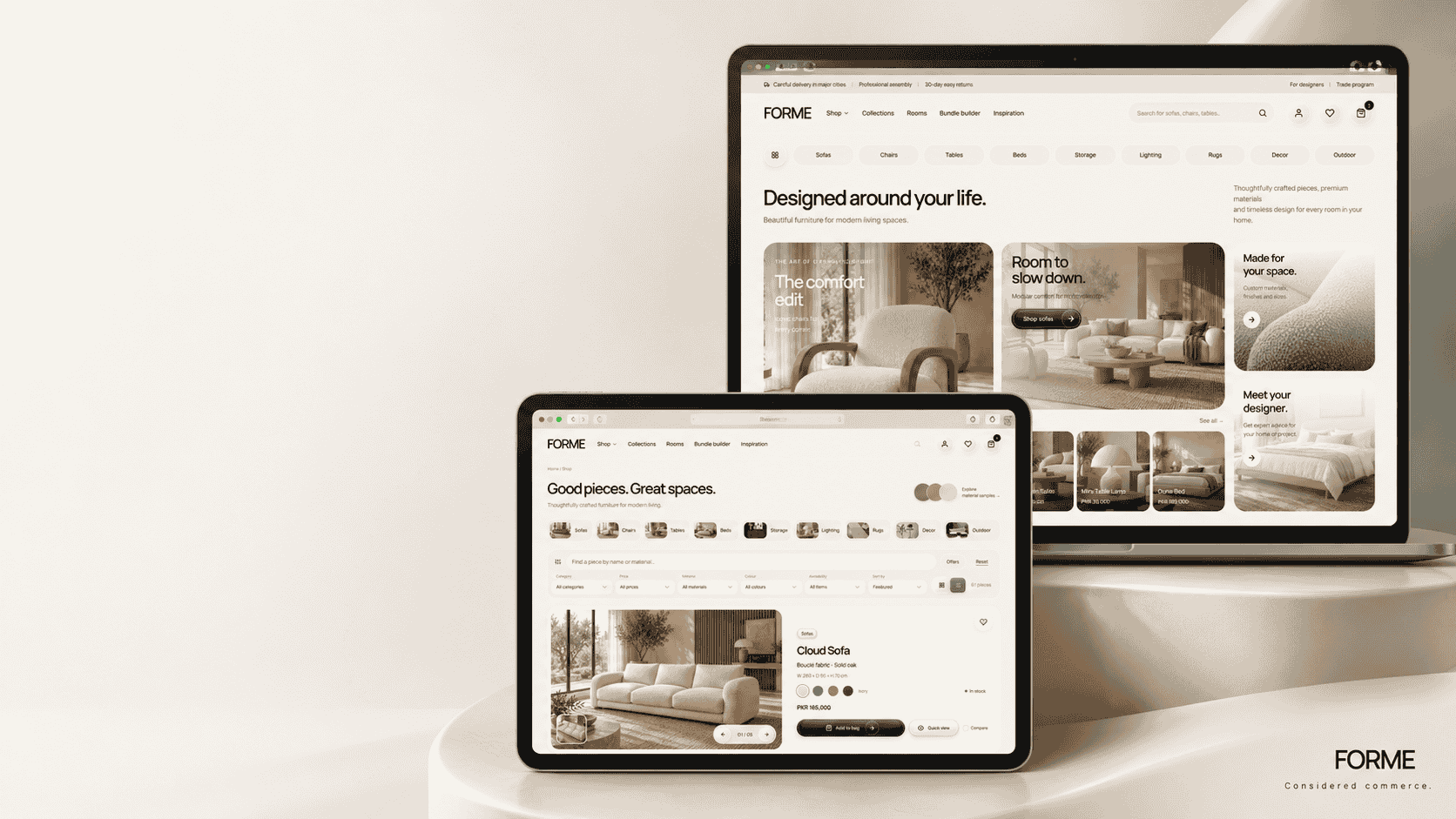
The catalogue contains 61 individually structured products and 320 local product and colour-variant images. Shop controls support filtering, sorting, quick previews and product comparison, helping customers narrow their choices without losing the visual character of the collection.
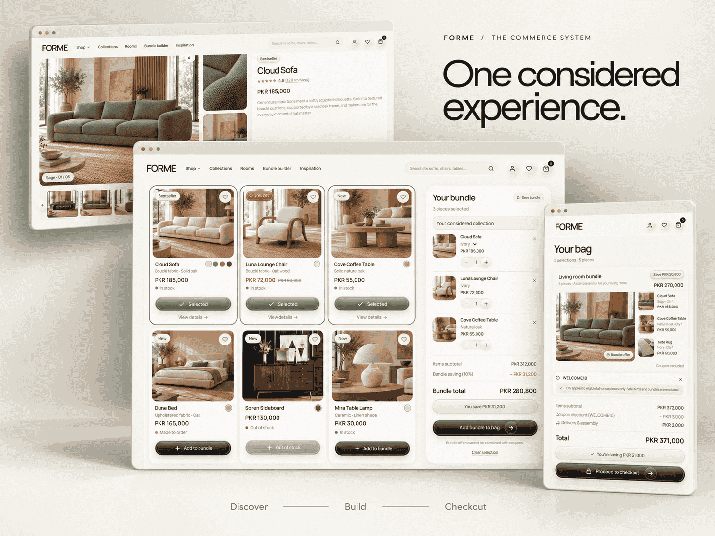
Product detail pages bring together an asymmetric gallery, colour selection, matching image sets, dimensions, material information and quantity controls. Attached product packages, bought-together suggestions, reviews and related pieces support a more complete purchase decision.
Bundled Shopping
The room bundle builder gives customers a way to assemble a coordinated selection. It opens with all items and allows filtering by room while preserving pieces already selected. Customers can adjust colours and quantities, review the combined price and add their selection as a separate bundle within the cart.
Pricing behaviour is consistent across the experience. Existing sale items and discounted bundles or attached packages are excluded from coupon discounts. Grouped cart entries keep the contents of a bundle visible and allow customers to update the complete selection without confusing it with individual product purchases.
Customer Journey
The scope includes the cart, wishlist, checkout and order confirmation pages. Checkout presents the complete order alongside customer details, delivery information and COD or online payment preferences.
Authentication interfaces cover login, signup, forgotten passwords, password reset and email verification. The customer dashboard continues the same design language through an overview, order history, individual order timelines, saved addresses and profile management.
About, contact, journal and supporting information pages complete the brand experience. Together, these pages give the storefront a coherent identity across product discovery, customer support and account management.
Implementation Approach
The frontend uses Next.js, TypeScript and Tailwind CSS, supported by customised shadcn/ui components. Framer Motion handles interface transitions, with GSAP used for a focused scrolling interaction.
Each major page is divided into section-based components. Shared buttons, badges, product cards, galleries and form controls keep presentation consistent and make ongoing changes easier to manage.
Redux Toolkit follows a clear structure with separate slices and action files. Shared pricing utilities coordinate cart totals, bundle savings and coupon eligibility. The delivered scope uses local demonstration state, with defined action files ready for future API integration. Authentication, payments and order fulfilment are presented as frontend flows rather than live backend services.
Final Outcome
FORME demonstrates how a luxury visual identity can extend across an entire commerce experience. Its editorial presentation gives the furniture space to stand out, while structured product information, flexible bundles and consistent shopping controls support practical use.
The result is a complete, responsive furniture frontend with a cohesive brand presence and an organised foundation for future commerce integrations.
Product Principles
5 decisions shaped the experience.
01
Product First
Lifestyle photography, colour-specific galleries and considered product information help customers understand the furniture before making a selection.
02
Sculpted Simplicity
Neumorphic controls, subtle glass effects and layered surfaces introduce depth while preserving readable content and a clear visual hierarchy.
03
Consistent Commerce
Bundle offers, existing product discounts and coupon eligibility follow shared pricing rules across the product, cart and checkout experiences.
04
Responsive Comfort
Layouts adapt across desktop, tablet and mobile, with a dedicated mobile menu, touch-friendly galleries and accessible purchase controls.
05
Purposeful Motion
Transitions, gallery interactions and section reveals support navigation and product exploration while respecting reduced-motion preferences.
System Thinking
Connected CommerceMaintainable Foundations
The frontend separates page sections, shared controls, catalogue data and application state into focused components. Redux Toolkit uses dedicated slices and action files, while shared pricing utilities keep shopping calculations consistent. This structure provides clear integration points for future catalogue, account, order and payment services.
Delivered a complete furniture commerce frontend covering discovery, product selection, bundles, checkout and customer account pages.
Structured 61 individual products with five gallery images each, including additional colour galleries for a total of 320 product and variant images.
Implemented room-based bundle creation with separate grouped cart entries and editable selections.
Applied coupon eligibility rules that exclude existing sale items and discounted bundles or packages.
Created a consistent customer dashboard for order history, order timelines, saved addresses and profile management.
Established a component-based TypeScript codebase with separate Redux slices and action files for future integrations.
Final Outcome
Considered DesignComplete Experience
FORME brings a cohesive luxury identity to a complete furniture shopping journey. The result combines an editorial storefront, detailed product exploration, flexible room bundles and a consistent customer account experience within a maintainable frontend.
Start something similar
Want a similarplatform, website or service?
If you have an idea, an existing product that needs improving, or a platform worth building properly, tell me what you are working on.
Next Project