
Modern RestaurantOrdering Experience
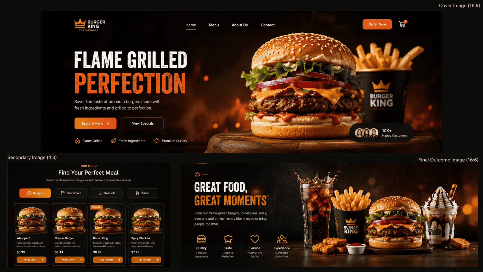
A modern restaurant website designed to make menu discovery simple and enjoyable, with clear food categories, rich product presentation and a responsive experience across desktop and mobile devices.
Project Perspective
A restaurant website should make choosing food easy.
Customers usually visit a restaurant website with a simple goal: understand what is available and quickly find something they want to eat. The interface was designed around that behavior, keeping menu categories clear, food presentation strong and navigation straightforward.
Project Snapshot
Role
Frontend Developer
Duration
3 Weeks
Year
2026
Core Stack
Next.js, React, Tailwind CSS, Framer Motion
Building around how customers actually browse a menu
The restaurant website was designed around a straightforward customer journey. Visitors should be able to understand the restaurant, explore the menu and find an item they like without navigating through unnecessary pages or complicated interfaces.
Menu Discovery
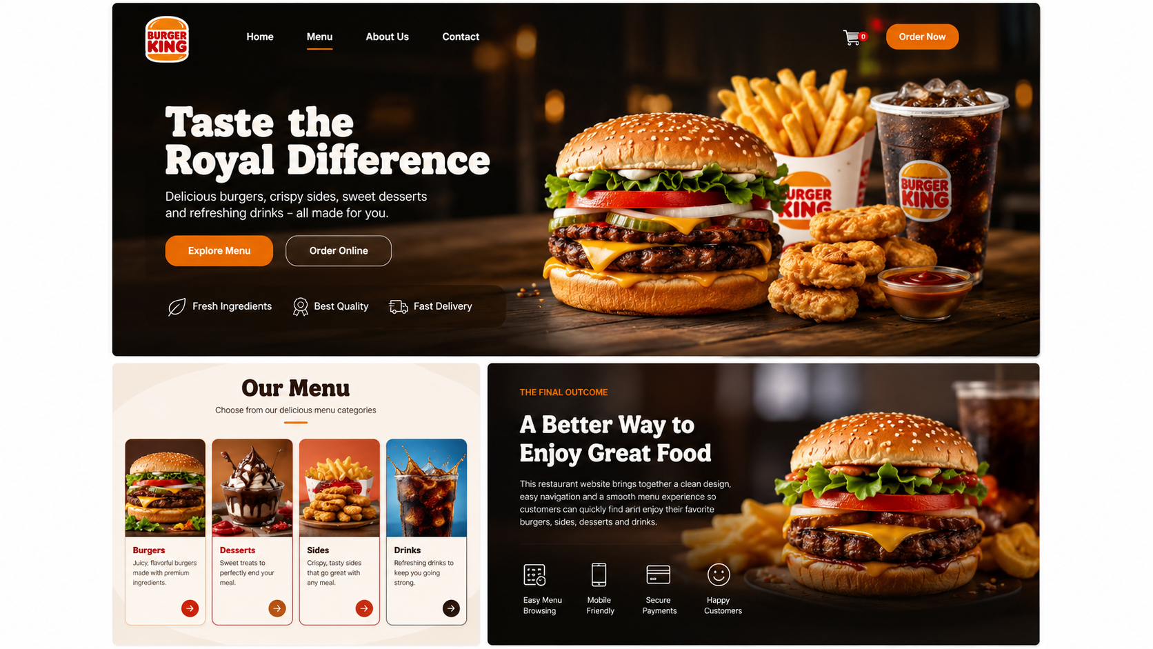
The main menu is divided into clear food categories including burgers, sides, desserts and drinks. This structure gives customers a familiar way to browse while keeping a larger collection of menu items organized.
Food Presentation
Menu cards use strong imagery, readable names, concise descriptions and clear pricing. The goal was to provide enough information for customers to make a decision while allowing the food itself to remain the main visual focus.
Reusable Menu System
The different menu categories use the same underlying component structure rather than separate layouts for every type of food. This keeps the interface consistent and makes future menu updates easier to manage.
Responsive Experience
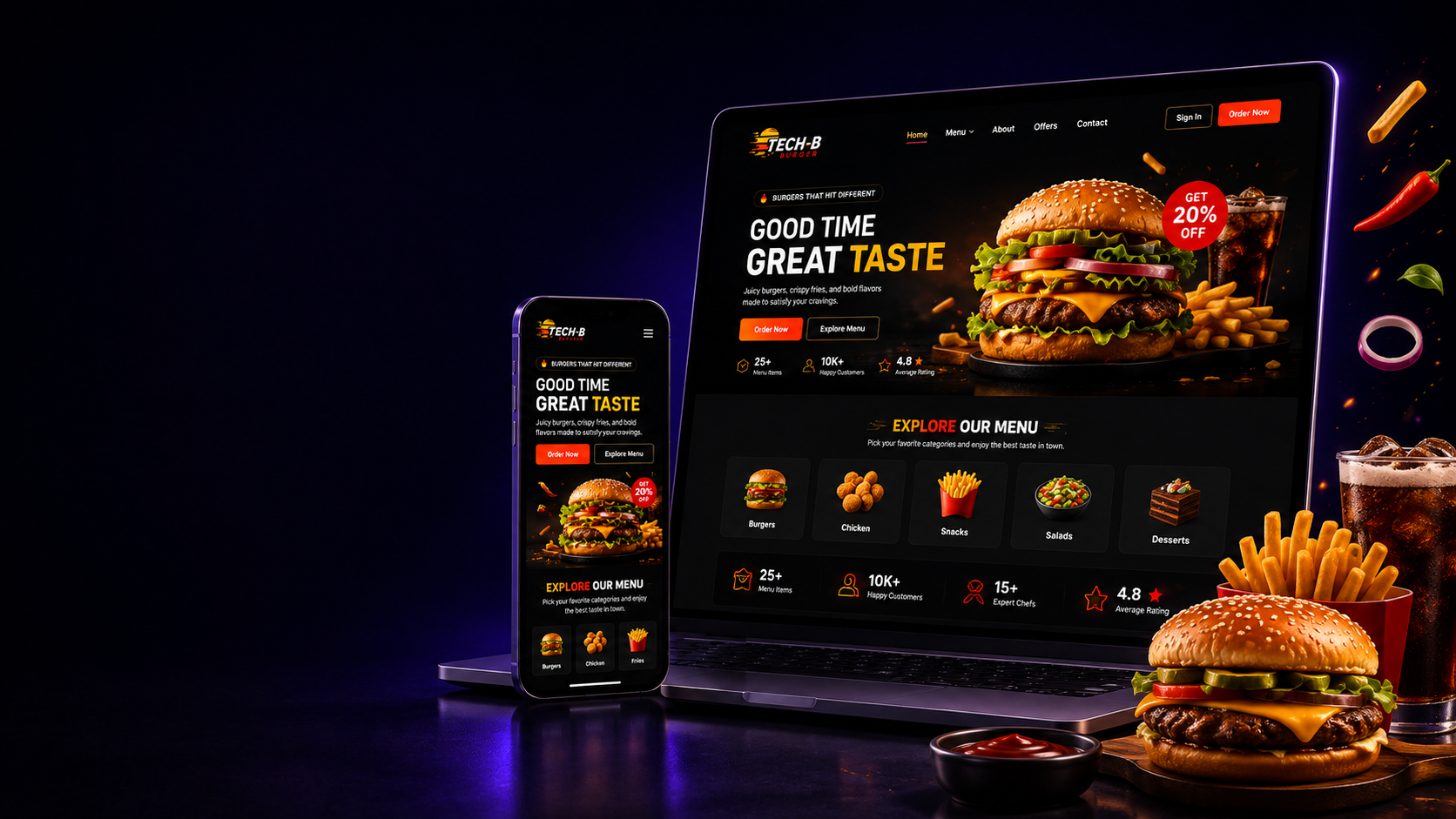
The website was designed for customers who may discover the restaurant from either desktop or mobile devices. Layouts, menu cards and navigation adapt across screen sizes while maintaining the same clear browsing flow.
Keeping the Experience Focused
Restaurant websites can easily become crowded with promotions, navigation and excessive information. This project takes a more focused approach, using the interface to support menu discovery rather than compete with it.
Product Principles
5 decisions shaped the experience.
01
Food comes first
The visual hierarchy gives menu items and food imagery the strongest presence, while supporting content stays simple and secondary.
02
Clear menu categories
Burgers, sides, desserts and drinks are separated into understandable categories so customers can move through the menu without unnecessary searching.
03
Simple product information
Each menu item presents the information customers actually need, such as the item name, description, price and relevant action, without overcrowding the card.
04
Responsive by default
The menu experience was designed to remain easy to browse on phones, tablets and larger screens, where restaurant customers are likely to access it.
05
Consistent restaurant identity
Typography, imagery, spacing and interactive elements follow one consistent visual system so the restaurant feels recognizable across every section.
System Thinking
One menu.Structured around real customer choices.
Instead of treating every food item as unrelated content, the website organizes the menu into reusable categories and product components. Burgers, sides, desserts and drinks share a consistent data and interface structure, making the experience easier for customers to understand and simpler to extend when new menu items are added.
Built a responsive restaurant website focused on clear food discovery and strong visual presentation.
Organized the menu into four distinct categories: burgers, sides, desserts and drinks.
Created reusable menu cards for consistent product names, descriptions, imagery and pricing.
Designed category navigation that helps customers quickly move between different parts of the menu.
Created a mobile-friendly browsing experience for customers accessing the restaurant from their phones.
Used reusable components to keep menu sections consistent and easier to maintain.
Added lightweight interactions and transitions to improve the browsing experience without distracting from the food.
Built a scalable menu structure that can support additional categories and products in the future.
Final Outcome
A restaurant experience that keepsthe menu at the center.
The finished website provides a clean and responsive way for customers to explore burgers, sides, desserts and drinks through one consistent menu experience. The result is a restaurant website that feels modern and visually engaging while remaining simple enough for customers to understand immediately.
Start something similar
Want a similarplatform, website or service?
If you have an idea, an existing product that needs improving, or a platform worth building properly, tell me what you are working on.
Next Project